
Step 11: set properties for single custom post types and archives
Step 11: set properties for single custom post types and archives
— Determine properties for single post that will be displayed on each post you add.
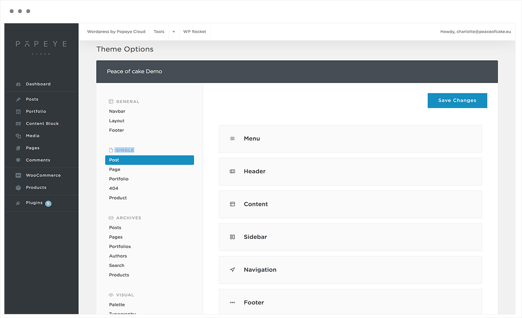
Wordpress by Popeye Cloud -> Theme Options -> Single
Here you can set the properties for single post, page, portfolio or product pages and their archives.
Tips 'n tricks
Important: after all the adjustments press save changesTip: if the changes are not visible on the website click WP-rocket-> clear cache

Step 10: specify the properties of the footer
Step 10: specify the properties of the footer
— Determine the width of the footer, widget area, copyright area and additionals.
Wordpress by Popeye Cloud -> Theme Options -> General -> Footer

Specify the footer to full width, change the content block, change the copyright area or hide the scroll up buttons.
Footer
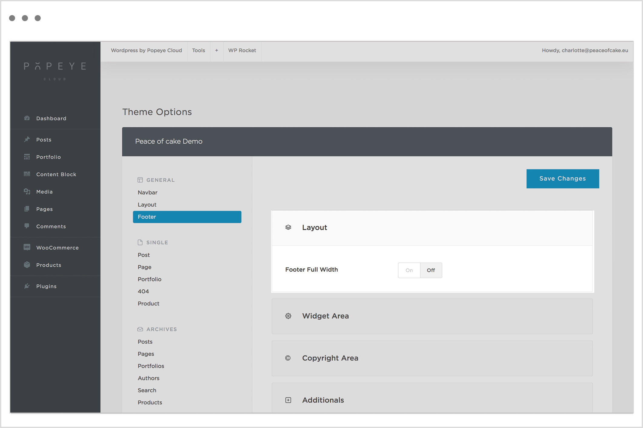
Footer Full Width
Expand the footer to full width.
Widget Area
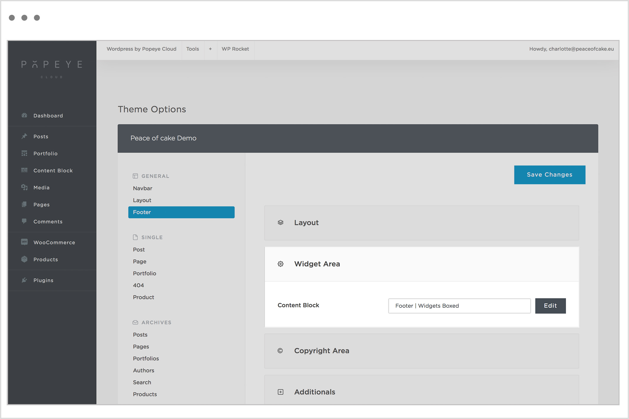
Content Block
Specify the Content Block to use as a footer content.
Copyright Area
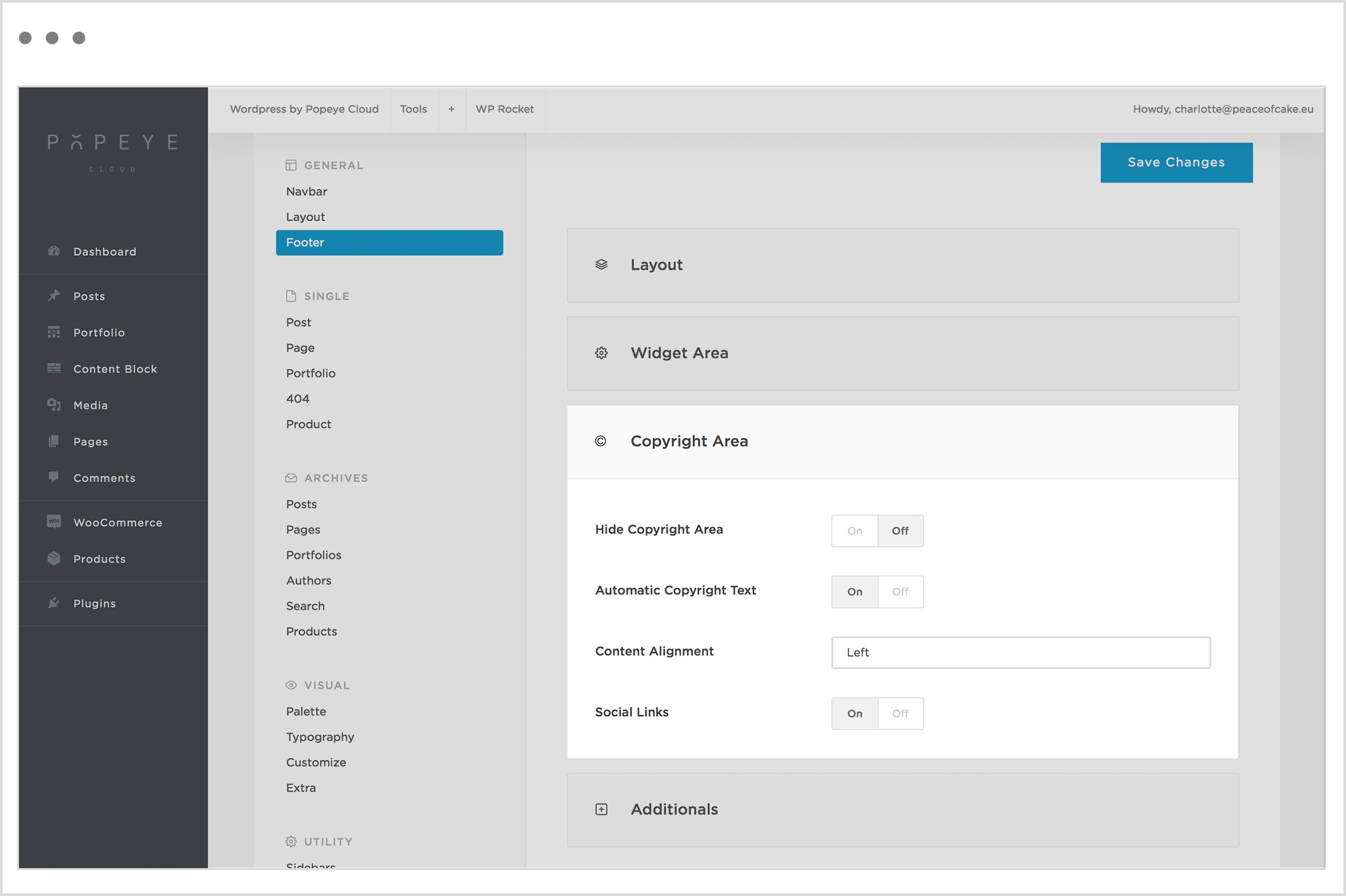
Hide Copyright Area
Activate this to hide the Copyright Area.
Automatic Copyright Text
Activate to use an automatic copyright text.
Content Alignment
Specify the footer copyright text alignment.
Social Links
Activate to have the social icons in the footer copyright area.
Additionals
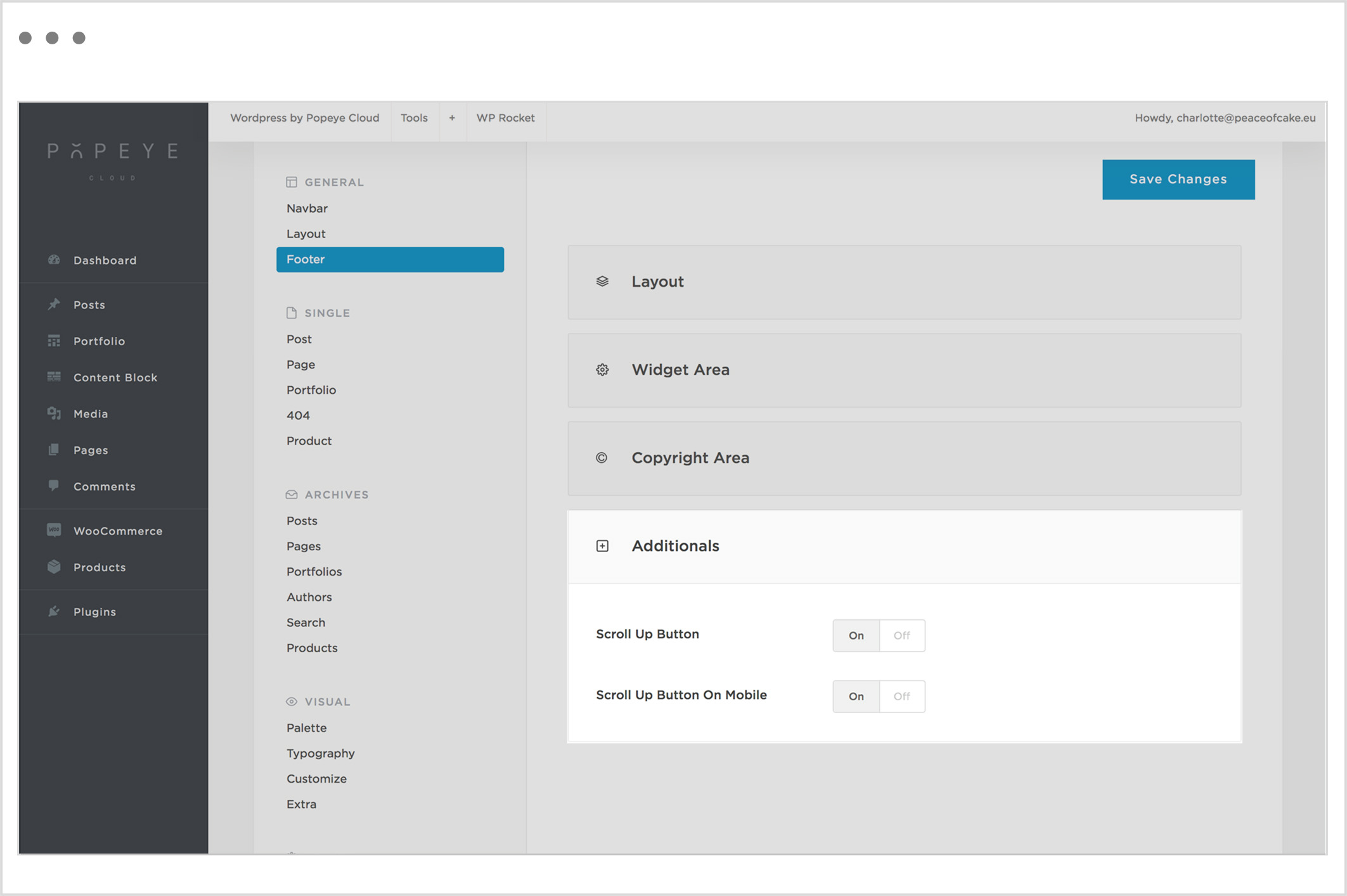
Scroll Up Button
Activate to add a scroll up button in the footer.
Scroll Up Button On Mobile
Activate to add a scroll up button in the footer for mobile devices.
Tips 'n tricks
Important: after all the adjustments press save changesTip: if the changes are not visible on the website click WP-rocket-> clear cache
Step 9: specify the general dimensions of your website
Step 9: specify the general dimensions of your website
— Set a site width that includes the with of the header and content.
Wordpress by Popeye Cloud -> Theme Options -> General -> Layout
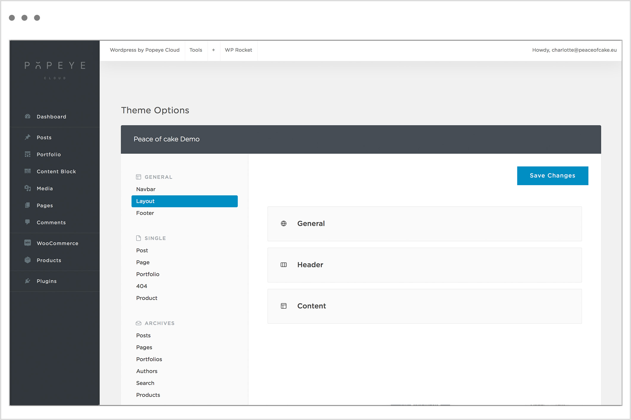
General
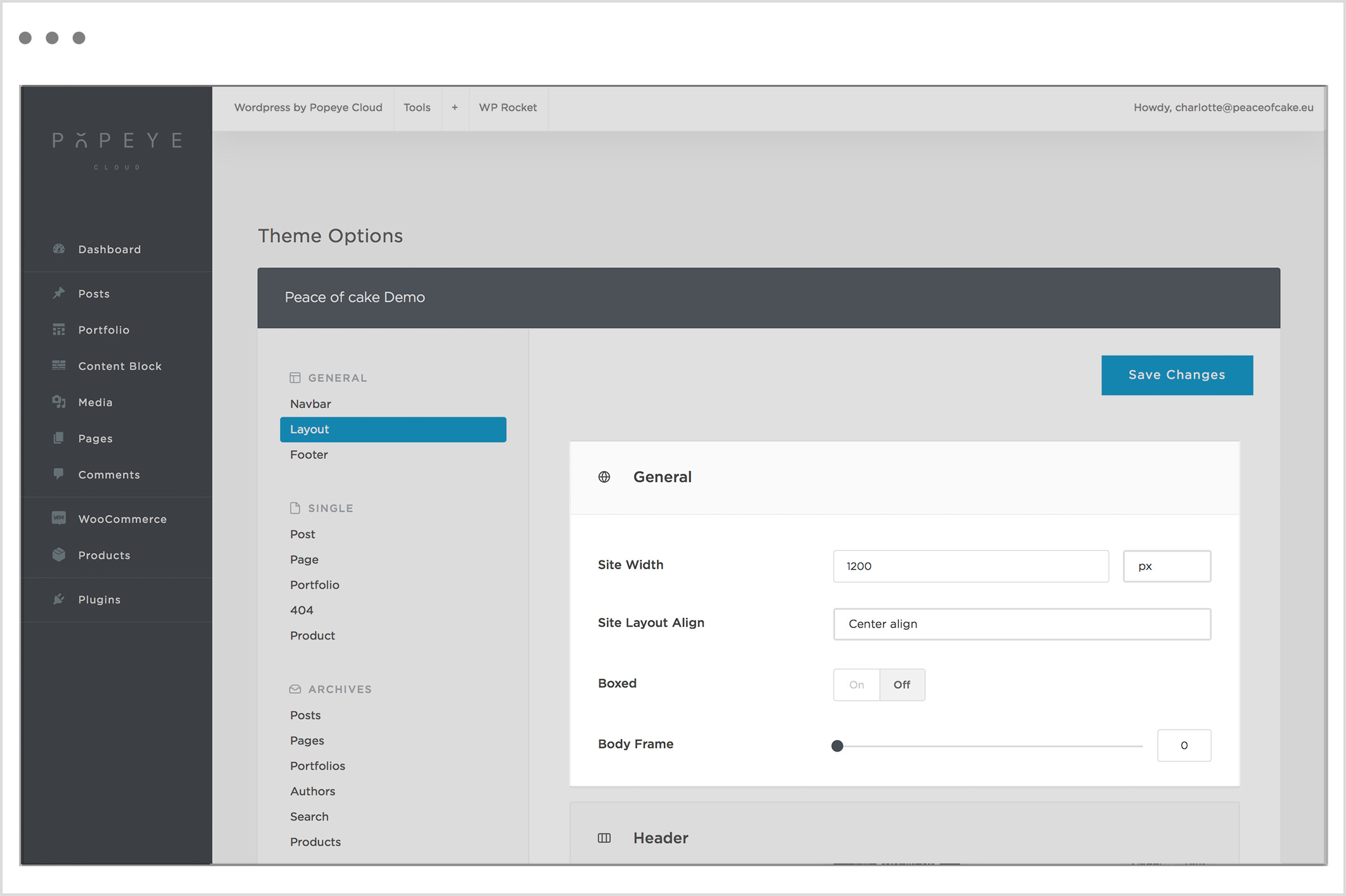
Site Width
Here you can set the width to a number of pixels of your choice. The most commonly used width is 1200px.
Alternately, you can change the site layout alignment and activate a boxed layout with a body frame to put a border around the website in the color of your choice. Next to these options you can also specify if the header or content container should be expanded to full width.
Site Layout Align
Specify the alignment of the content area when is less then 100% width.
Boxed
Activate for the boxed layout.
Body Frame
Specify the thickness of the frame around the body
Header
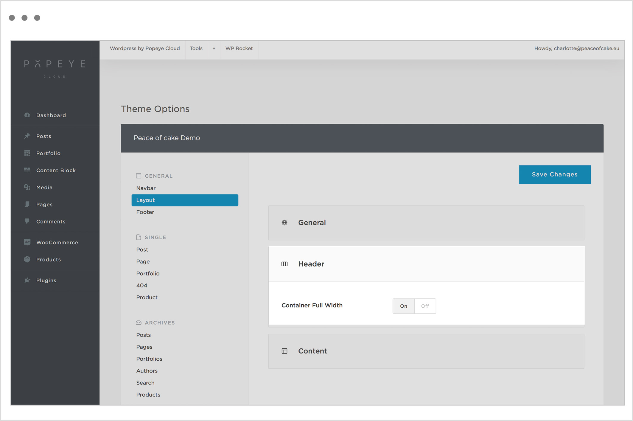
Container Full Width
Activate to expand the header container to full width.
Content
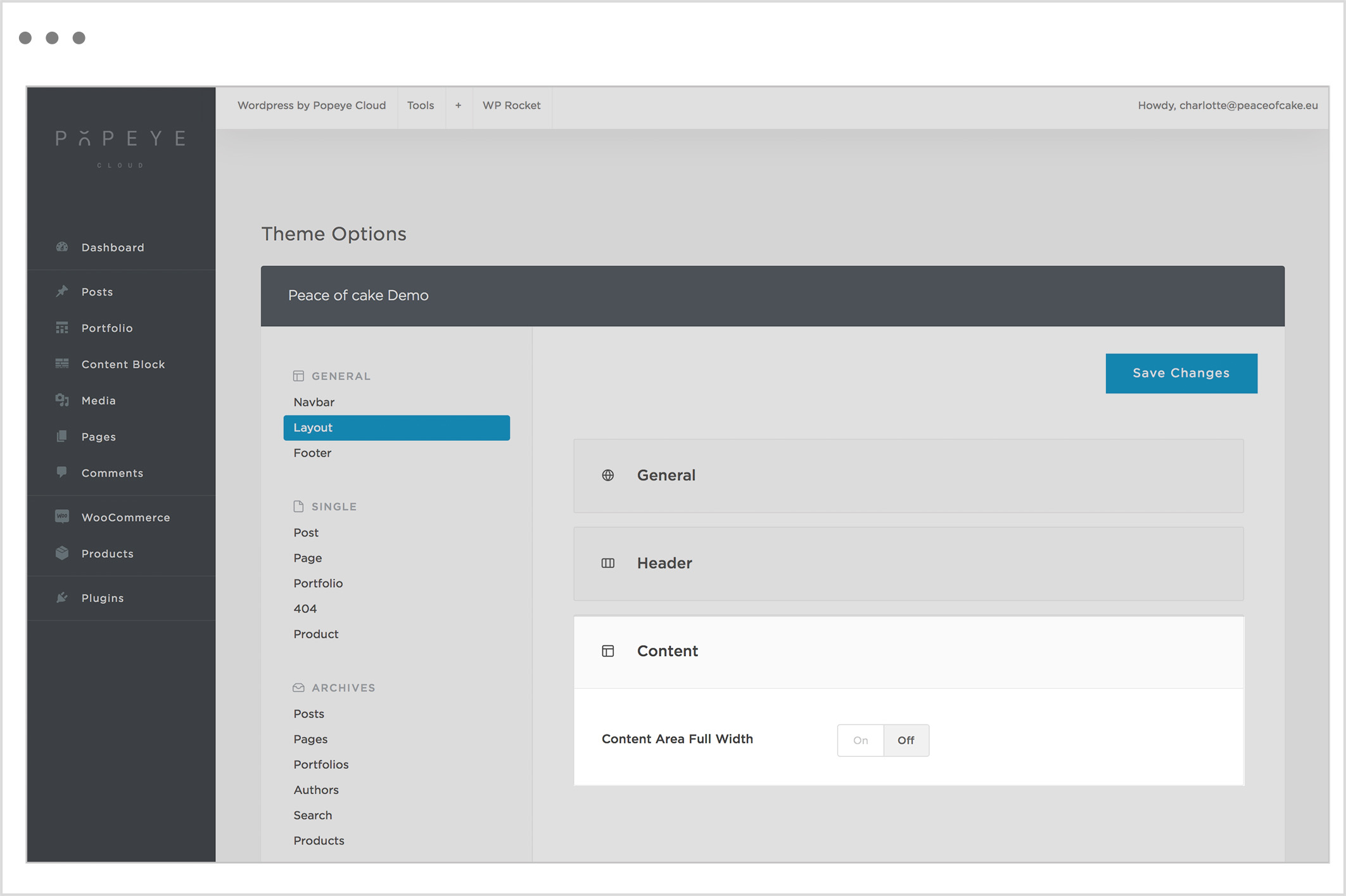
Content Area Full Width
Activate to expand the content area to full width.
Tips 'n tricks
Important: after all the adjustments press save changesTip: if the changes are not visible on the website click WP-rocket-> clear cache
Step 8: show additional parts to the menu
Step 8: show additional parts to the menu
— Check which parts of the menu are showing.
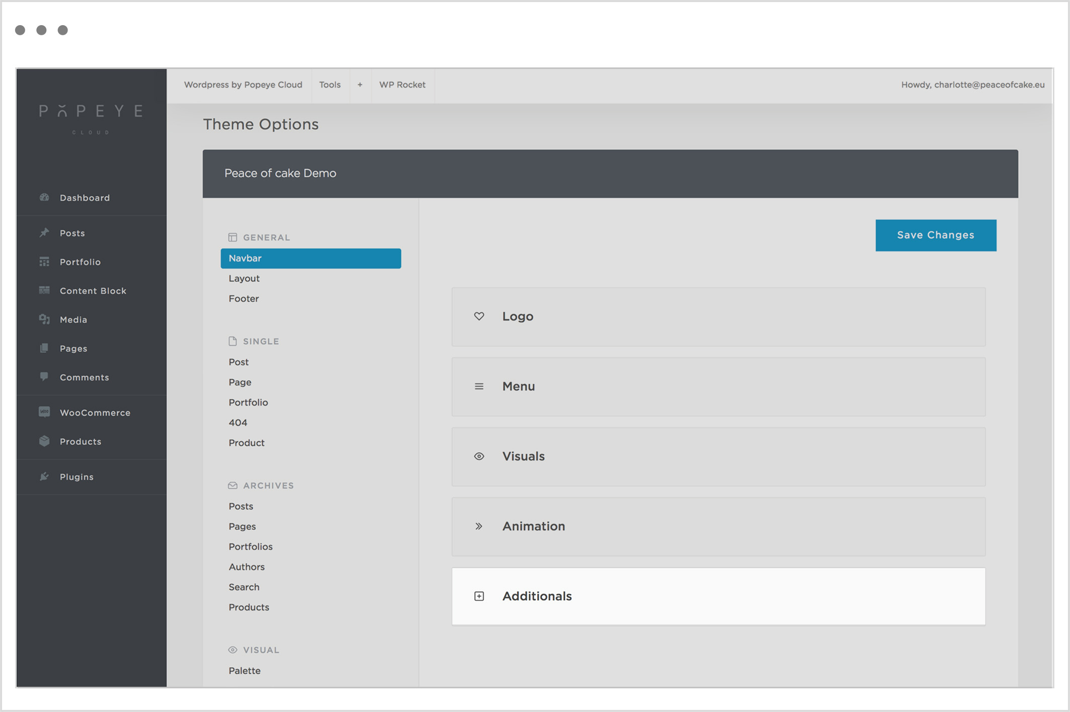
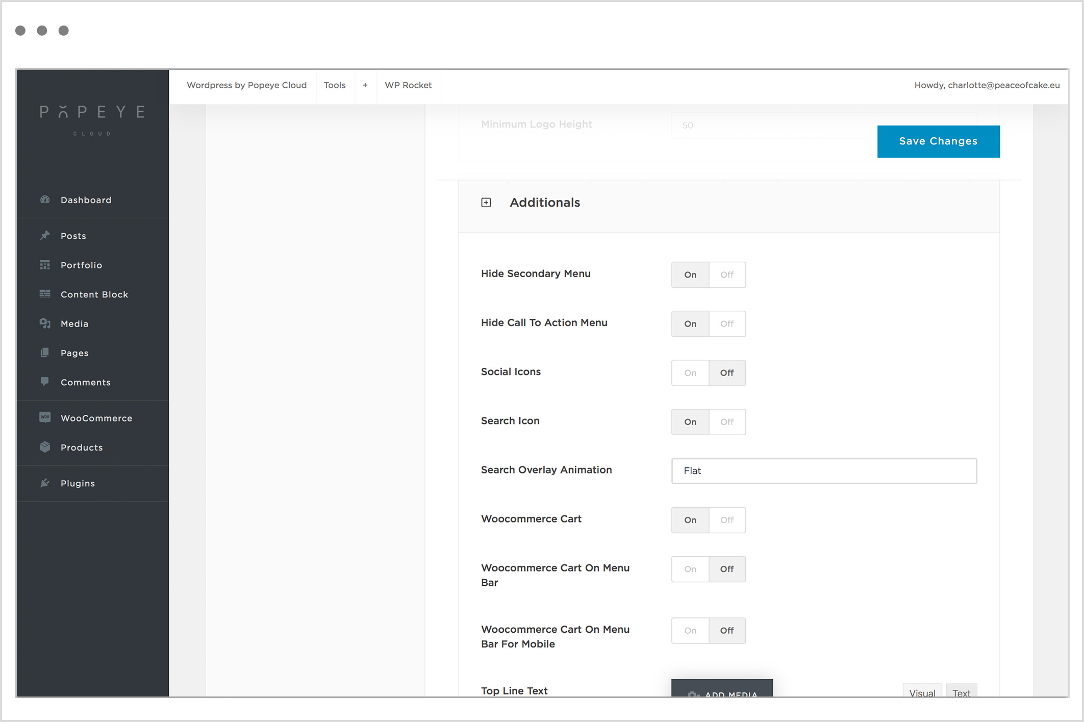
Hide Secondary Menu
Activate to hide the secondary menu. E.g. language options
Hide Call To Action Menu
Activate to hide the Call To Action menu. E.g. shopping basket
Social Icons
Activate to show the social connection icons in the menu bar.
Search Icon
Activate to show the search icon in the menu bar.
Search Overlay Animation
Specify the search overlay animation when opening and closing.
Woocommerce Cart
Activate to show the Woocommerce icon in the menu bar.
Woocommerce Cart On Menu Bar
Show the cart icon in the menu bar when layout is on desktop mode (only for Overlay and Offcanvas menu).
Woocommerce Cart On Menu Bar For Mobile
Show the cart icon in the menu bar when layout is on mobile mode.
Tips 'n tricks
Important: after all the adjustments press save changes
Tip: if the changes are not visible on the website click WP-rocket-> clear cache
Step 7: add menu behavior
Step 7: add menu behavior
— Determine how the menu behaves when a visitor scrolls on the website.
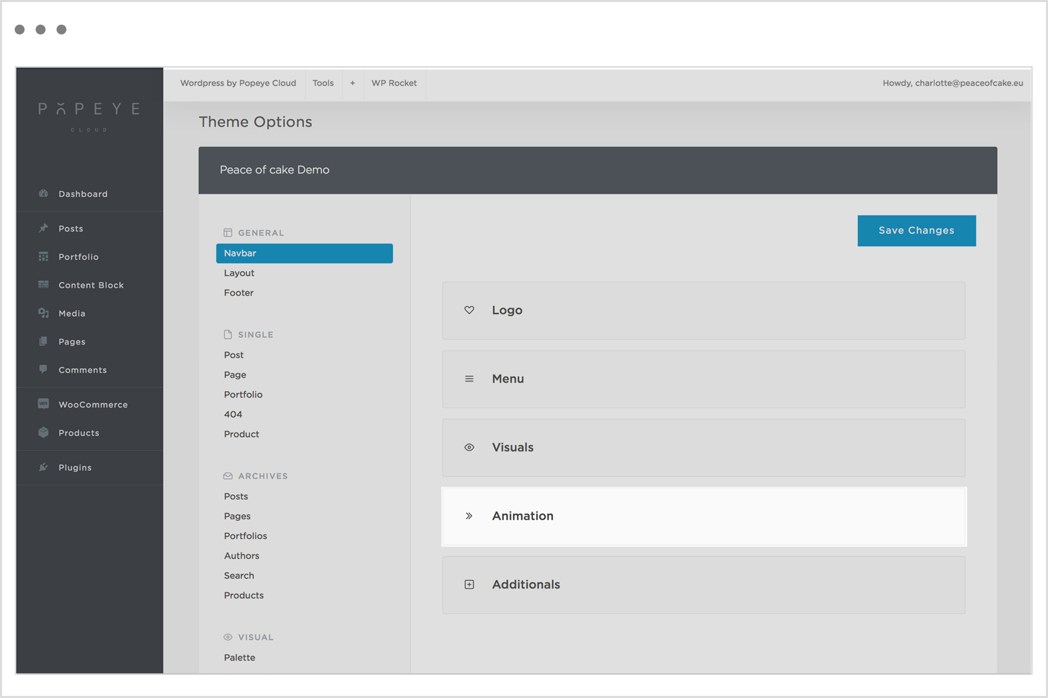
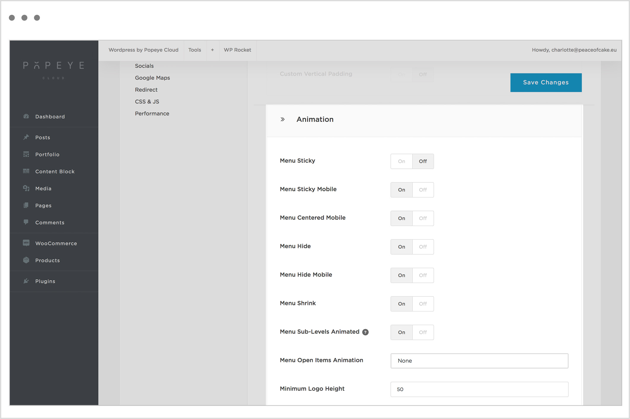
Menu Sticky
Activate the sticky menu. This is a menu that is locked into place so that it does not disappear when the user scrolls down the page.
Menu Sticky Mobile
Activate the sticky menu on mobile devices. This is a menu that is locked into place so that it does not disappear when the user scrolls down the page.
Menu Centered Mobile
Activate the centered style for mobile menu. NB. You need to have the Menu Sticky Mobile active. The items in your menu will be centered in an open menu.
Menu Hide
Activate the autohide menu. This is a menu that is hiding after the user have scrolled down the page.
Menu Hide Mobile
Activate the autohide menu on mobile devices. This is a menu that is hiding after the user have scrolled down the page.
Menu Shrink
Activate the shrink menu. This is a menu where the logo shrinks after the user have scrolled down the page.
Menu Sub-Levels AnimatedActivate the animation for menu sub-levels. NB. this option works for horizontal menus only.
Menu Open Items Animation
Specify the menu items animation when opening.
Minimum Logo Height
Enter the minimal height of the shrinked logo in px.
Tips 'n tricks
Important: after all the adjustments press save changes
Tip: If the changes are not visible on the website click WP-rocket-> clear cache
Step 6: add visual elements to your menu
Step 6: add visual elements to your menu
— Add visual elements to your menu for a clearer overview.
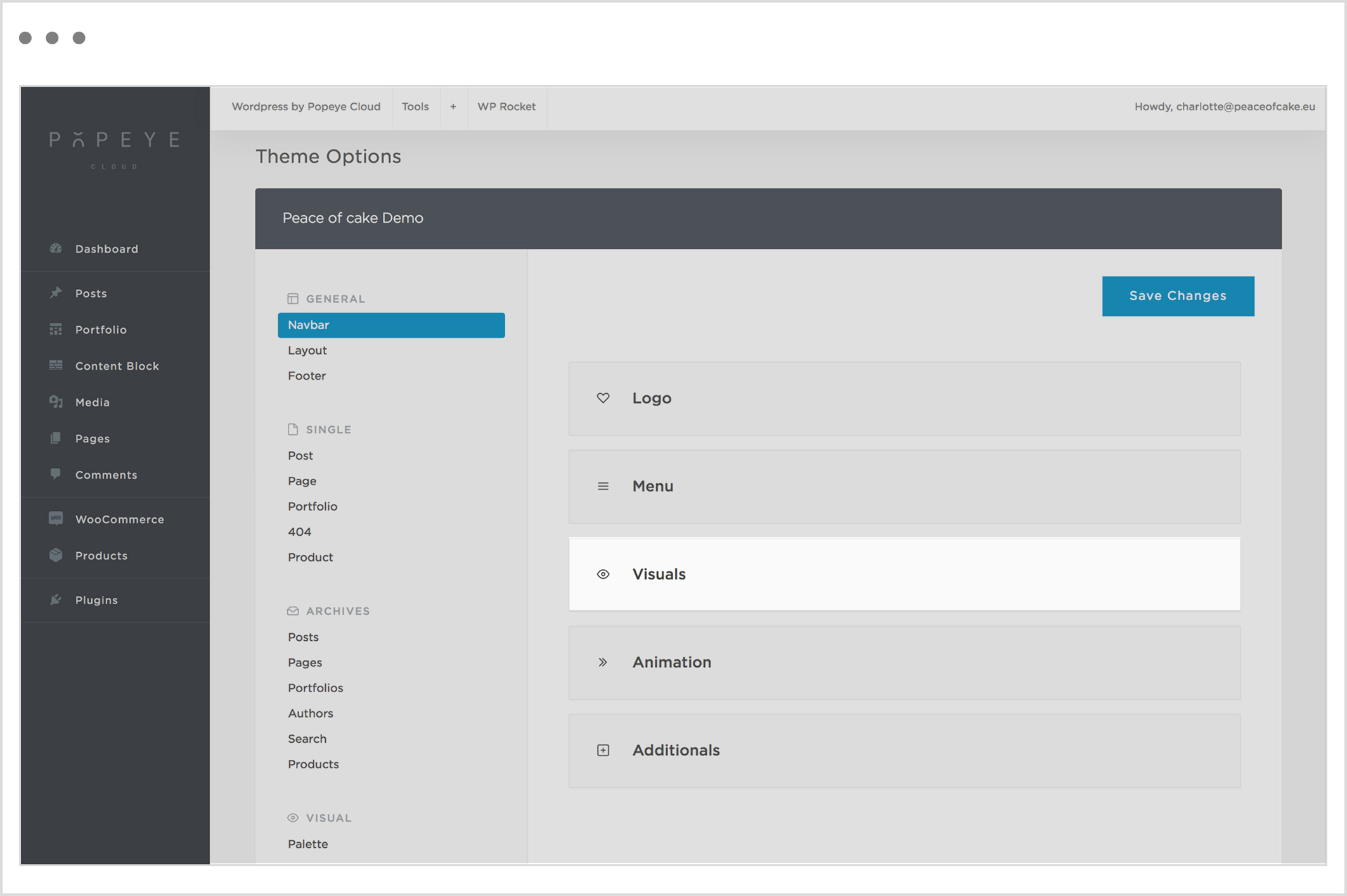
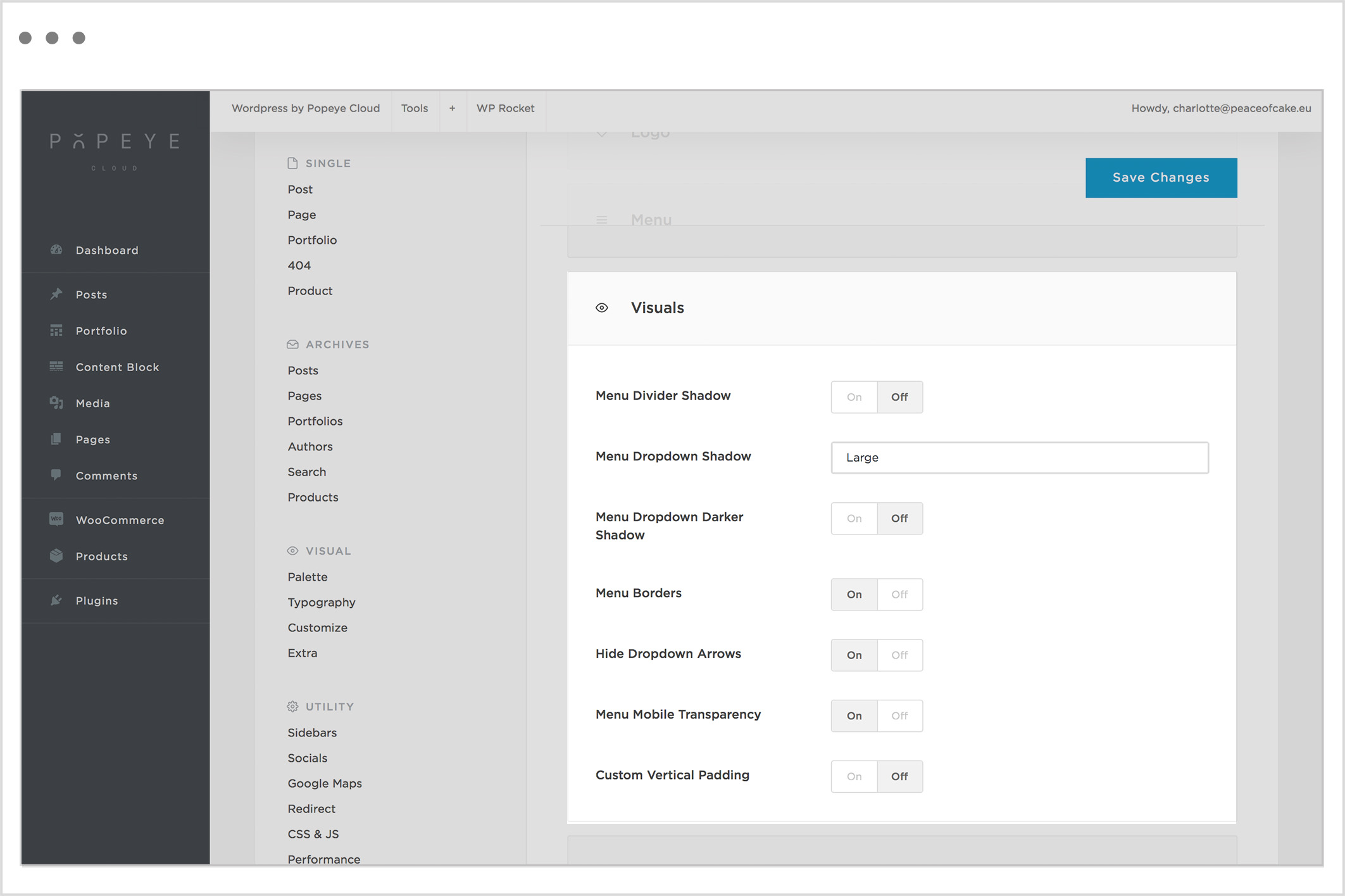
Shadows
Menu Divider Shadow:
activate to show the menu divider shadow.
Menu Dropdown Shadow
Activate this for the shadow effect on menu dropdown on desktop view. NB. this option works for horizontal menus only.
Menu Dropdown Darker Shadow
Activate this for the dark shadow effect on menu dropdown on desktop view.
Border
Menu Borders
Activate to show the menu borders.
Arrows
Hide Dropdown Arrows
Activate to hide the dropdow arrows. (The arrows to expand submenu)
Transparency
Menu Mobile Transparency
Activate the menu transparency when possible. Logo has a transparent background on mobile device.
Padding
Custom Vertical Padding
Activate custom padding above and below the logo.
Tips 'n tricks
Important: after all the adjustments press save changes
Tip: If the changes are not visible on the website click WP-rocket-> clear cache
Step 5: select a style for your menu
Step 5: select a style for your menu
— There are three different menu styles.
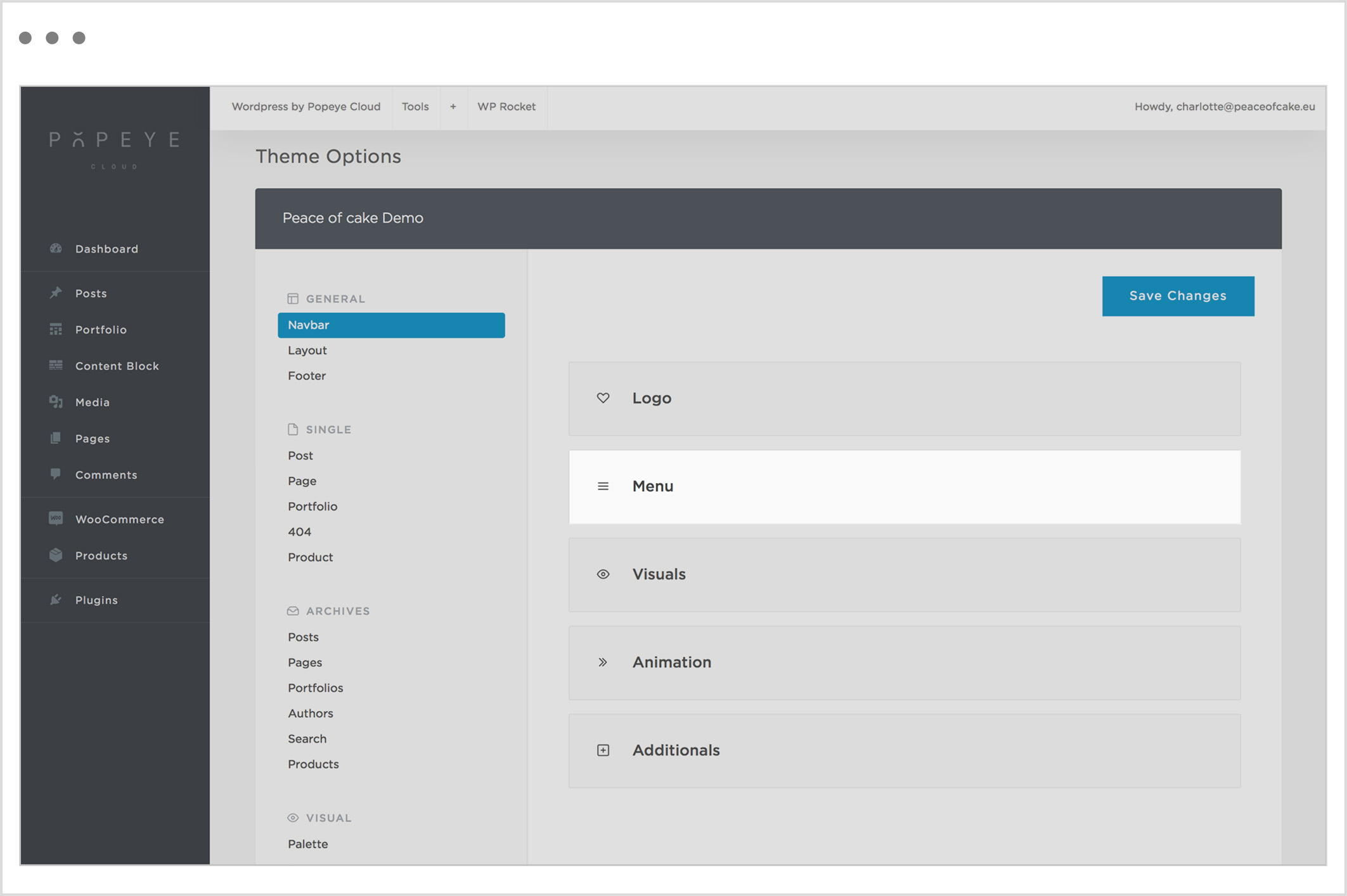
Horizontal menus
Menu bar at the top of the on the window.
The different alignments: right, justify, left, center, center split or center double.
Vertical menus
The menu bar vertically on the left side of the right side of the window.
The different alignments: lateral or offcanvas
Overlay menus
Hamburger menu on desktop.
The different alignments: overlay or overlay center.
Menu position
Menu Horizontal Position: specify the horizontal position of the menu.
Menu width
Menu Full Width: activate to expand the menu to full width. (Only for the horizontal menus).
Tips 'n tricks
Important: after all the adjustments press save changes
Tip: If the changes are not visible on the website click WP-rocket -> clear cache
Step 4: add your logo
Step 4: add your logo
— Add a logo for your website. You can add multiple logo's (a light and a dark version).
Wordpress by Popeye Cloud -> Theme options
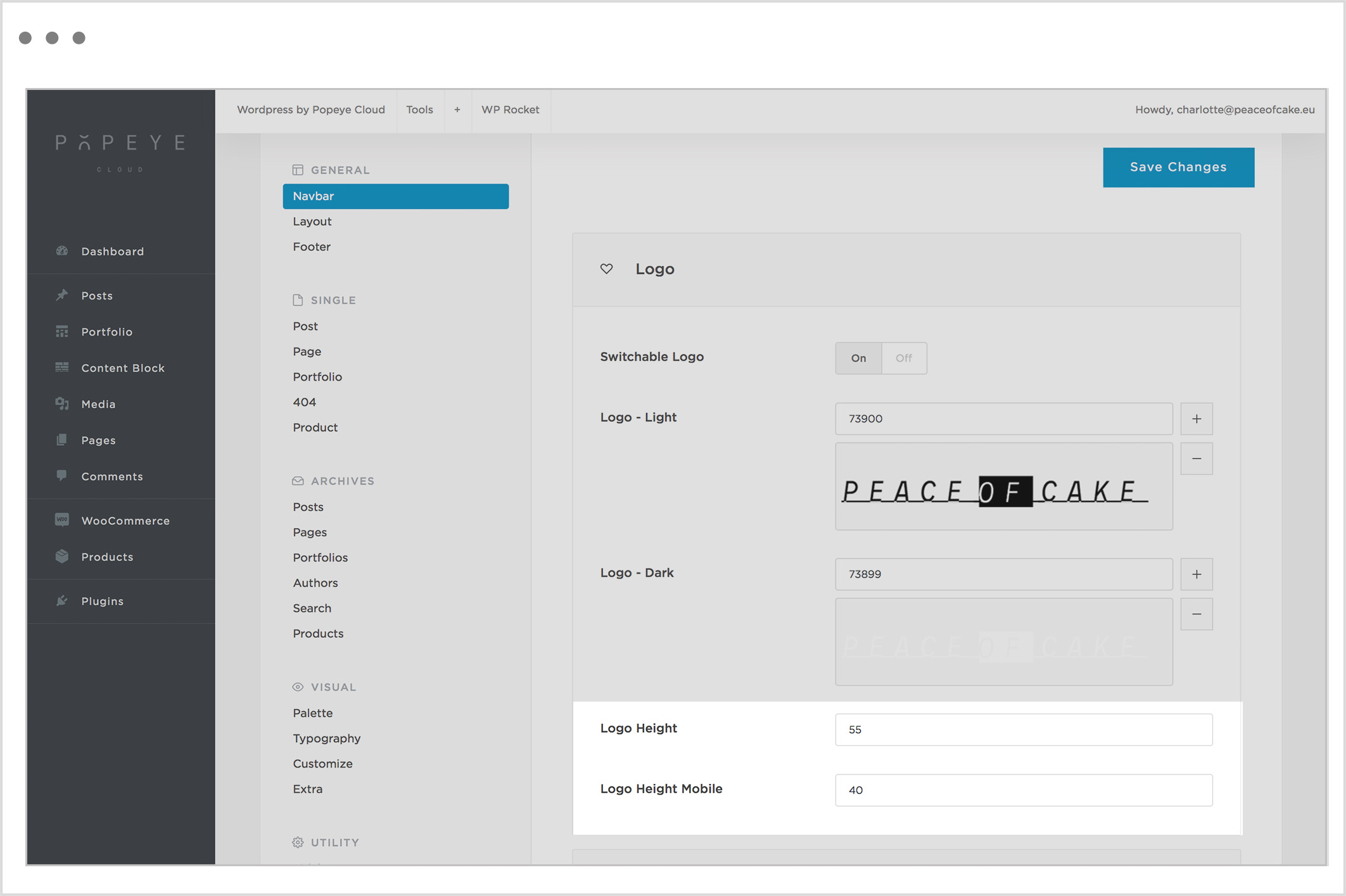
General -> navbar -> logo
Here you can make all kind of logo adjustments.
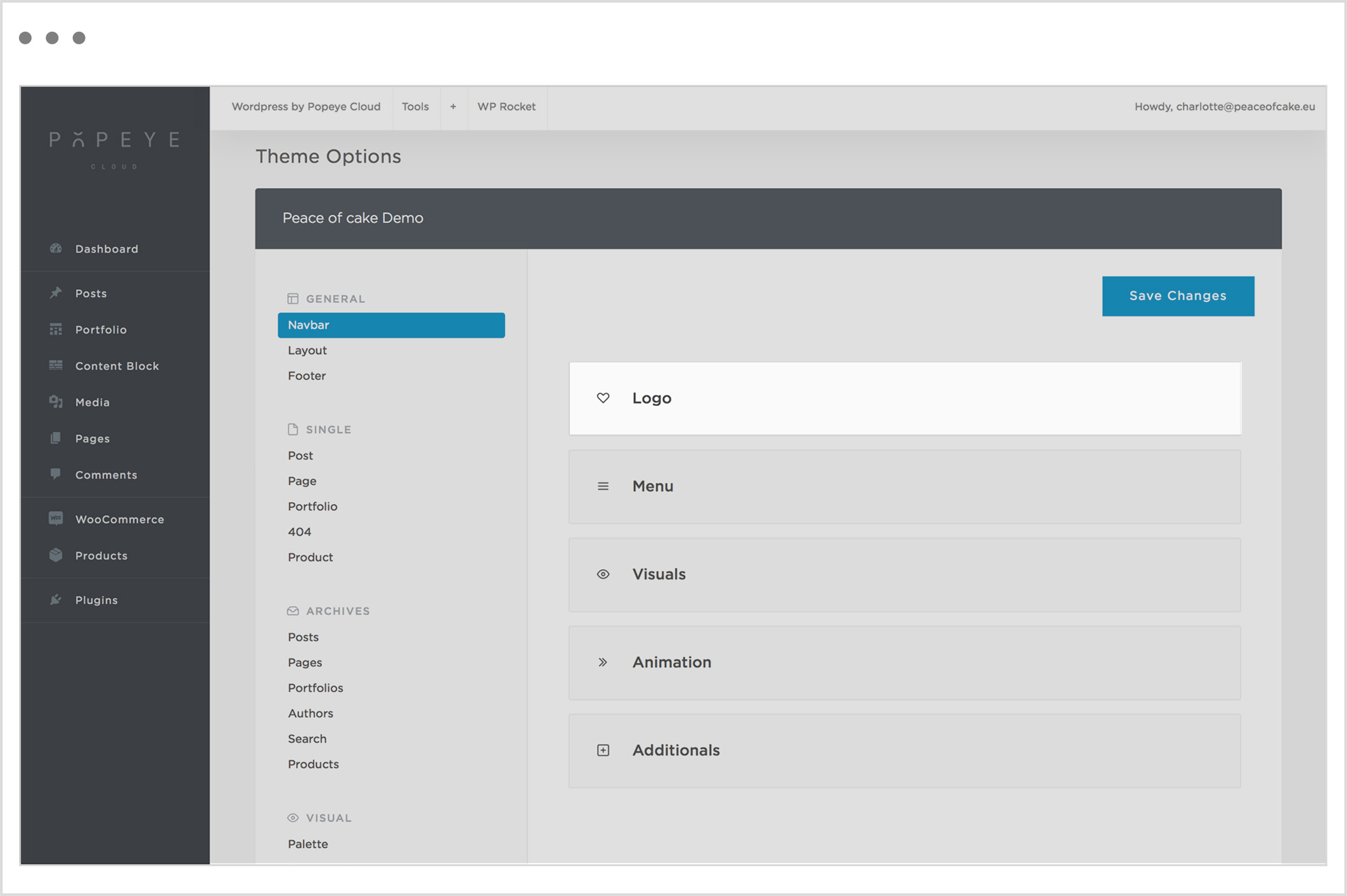
Positive and negative
Switchable Logo: Activate to upload different logo for each skin.
Turn off when you only want to use the white or black version.
Turn on to place a black and white variation of the logo, with transparent background, in the menu bar.
Logo-light: Black version on a light background
Logo-dark : White version on a dark background
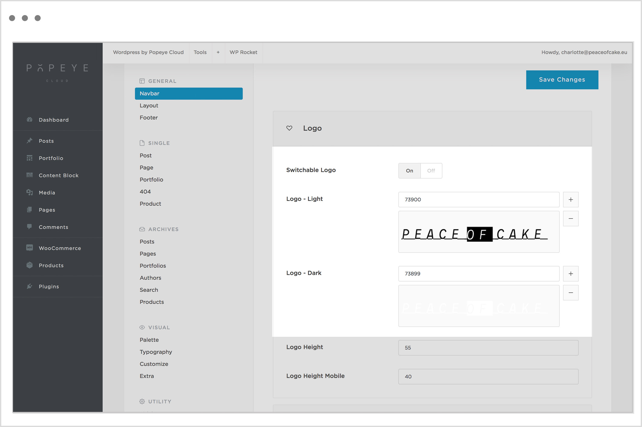
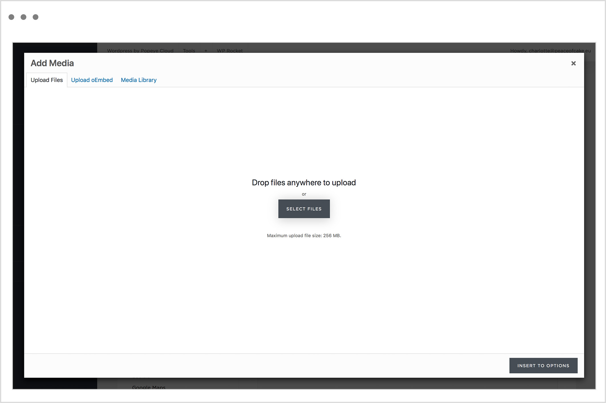
Upload logo
Click on the plus sign to upload a logo.
Select files –> insert logo or select one out of the media library.
Upload a negative version (black) and a positive version (white) of your logo
Height
Logo Height: Enter the height of the logo in px.
Logo Height Mobile: Enter the height of the logo in px for mobile version.
Tips 'n tricks
Important: after all the adjustments press save changes
Tip: if the changes are not visible on the website click WP-rocket-> clear cache
Step 3: create a new menu
Step 3: create a new menu
— Learn how to create a menu. This menu will be the navigation on the website.
Wordpress by Popeye Cloud -> navigation
Create a new menu
Create a new menu -> choose a menu name e.g. primary menu.
On the left side, add menu items. Choose a page title and add to menu. Now you have linked the page with the menu.
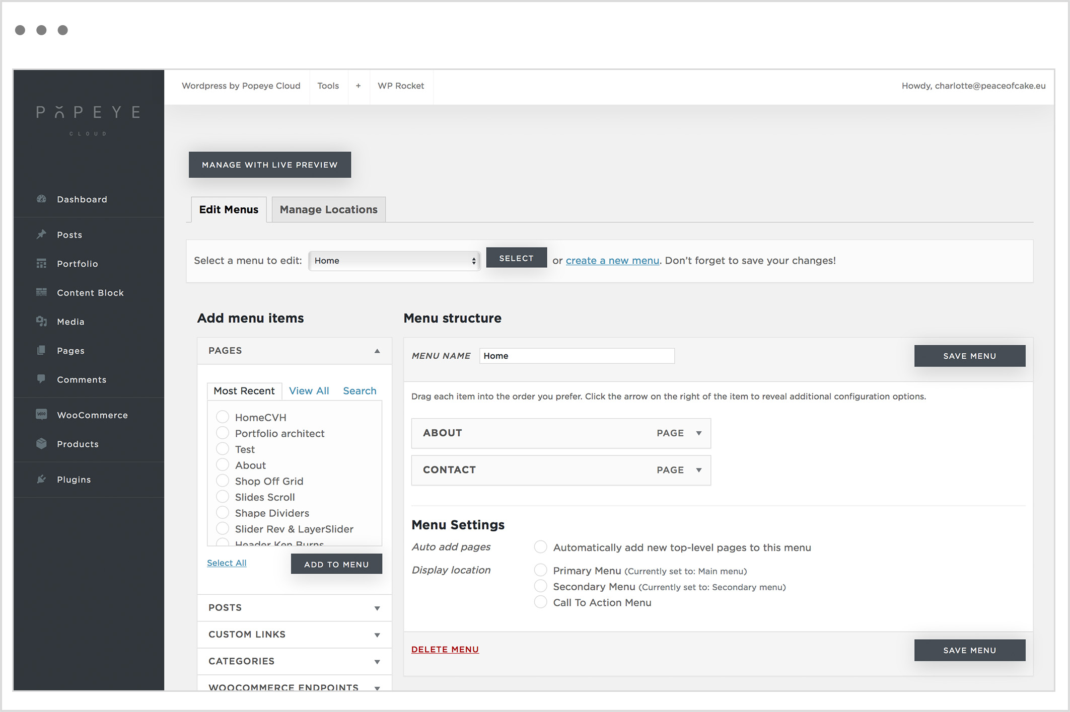
Each menu item has several properties:
Navigation Label: The name that will be displayed in the menu.
Icon: Choose an icon by clicking on the ‘icon’ button.
Button style: Shows the menu item as a button.
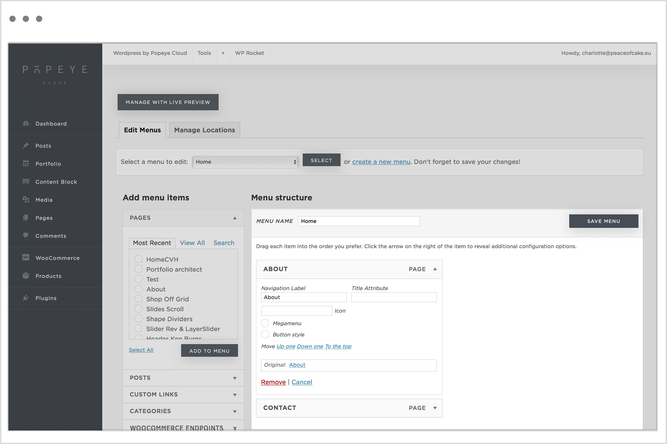
Menu items can be dragged in a different order by dragging vertically up and down. If you drag an element horizontally they menu item becomes a submenu.
Custom links are used to refer to an anchor point (a specific part of a page). You can use an external link by placing the name of the anchor point at the back of the external link preceded by a hashtag. For example yourwebsite.com/home#about.
Important: After you have created your menu you have to assign it to a display location. You have three locations to display your menu.
- Primary Menu: classic menu location.
- Secondary Menu: placed above the primary menu and always subordinate to the primary menu. It is formatted in a smaller font and right aligned. E.g. include language options, login,…
- Call to action menu: placed at the same level on the right side of the primary menu. These are possibly separated by a dividing line. Is mainly used as a search button or shopping basket.
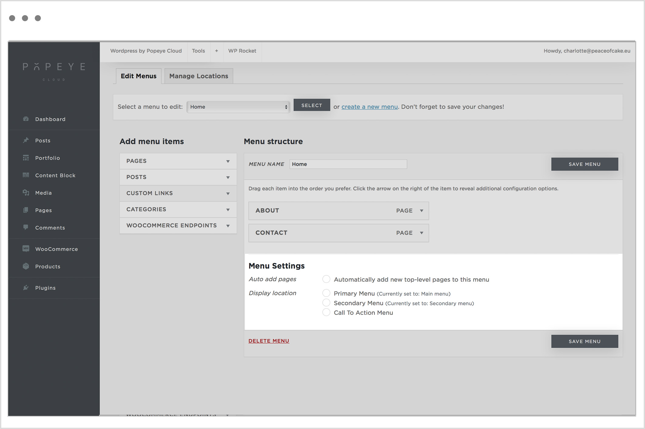
When you have made all the customizations, select “save menu”.
Tips 'n tricks
Don't forget to save the menu that you created. By dragging menu items you can determine the order. The item at the top will be displayed first and so on.
Step 2: homepage settings
Step 2: homepage settings
— Determine the name of the website.
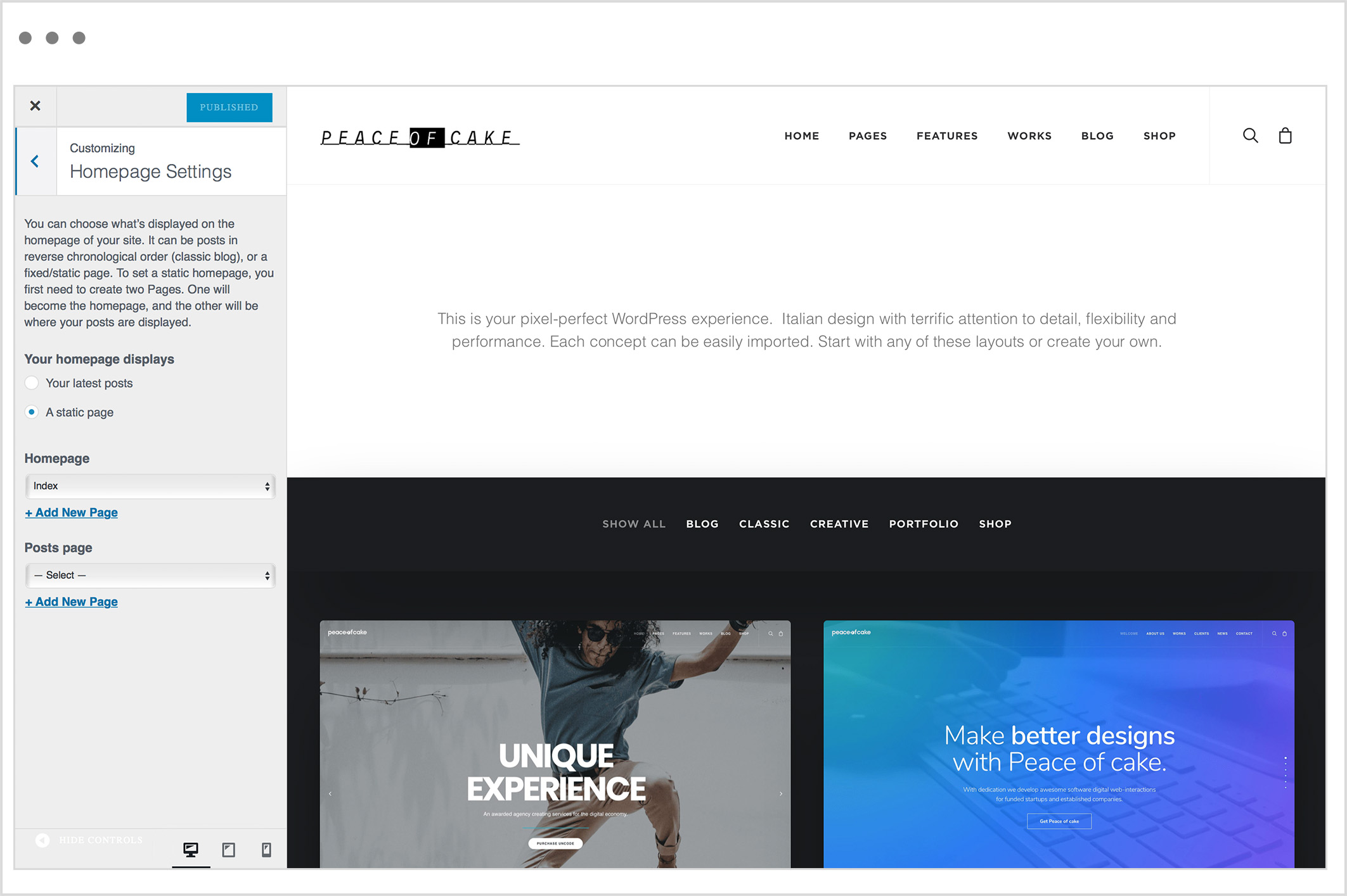
Wordpress by Popeye Cloud -> Homepage Settings
Go to Homepage. Choose the name of the title you made in step 1. The default is ‘index’.